Kit Design Tutorial for BeginnersHere

fsc ea

So it’s begun. A month or so of football endeavours with the end result being the crowning of the world champions. Will it be Spain? Brazil? Italy? Dare we say it, England?!

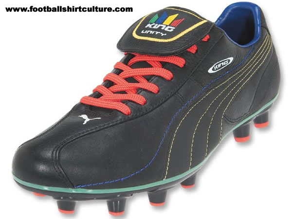
Whatever happens, the dual endeavours of Nike and Umbro will surely triumph over the estranged siblings, Puma and adidas.

Britain’s Umbro has had a resurgence since being augmented by the immence power of the Americans Nike and the once fearsome Germans have crumbled. The World War II analogy was too obvious to ignore but that’s enough of that now.

Yes, so over the last year or so Nike and their recent acquisition Umbro have made mincemeat out of the competition. The kits have generally been far superior to anything else on the market, the first few days of this World Cup have produced a sea of Superfly II Elite’s on the feet of the players and the marketing has taken the two brands to a new level.

The thing is, Nike and Umbro employ geniuses. Perhaps evil geniuses but geniuses all the same.

If we look at rugby football for a second, adidas are incredibly proud to hold the contract for the All Blacks. So proud of this association and with such faith in the commercial rewards, adidas even allow New Zealand to veto their famous three stripes. What a coup for adidas. So what do Nike do? It’s very simple. They take their modest contract with the New Zealand association football team and dress their most burly player, Ryan Nelson, in a black away kit and call some photographers to take some pictures. In one wonderfully unsubtle chess move, Nike show the Kiwis how their rugby team would look in their own creation. But will Nike ever take over the All Blacks deal? Inevitable understates it.

Nike also have used the power of Umbro to accelerate their pursuit of dominance. When the takeover was complete most expected Nike to poach all of Umbro’s most high profile contracts. But Nike are cuter than that. Instead, they funded the new Tailored By concept and left Umbro with enough new (media) marketing ammunition to deliver in the most comprehensive and impressive way. And once Umbro proved themselves with critical and commercial successes such as the last England home and away strips they went straight to the front of Nike’s World Cup kits launch. With John Terry’s indiscretions seriously hampering his marketing value, the focus shifted away from an Umbro boot and shirt wearing icon. No, instead Wayne Rooney’s Swoosh-footed and double diamond-chested brilliance was the key to marrying the two brands in the public’s consciousness. One minute a photoshoot, the next, Nike and Umbro are writing the future.

So to that ad. If you somehow haven’t seen it, I’ve embedded it below because it deserves it, impartiality notwithstanding. It has Gael Garçia Bernal playing Ronaldo! It has a song about Cannavaro with added cabaret dancers! IT HAS HOMER SIMPSON WITH A BRILLIANT USE OF “D’OH!”

Just to note, the World Cup kits Nike and Umbro have released are generally classy and minimalist. Puma and adidas have released tight shirts which are somewhat hit and miss. It’s not one way traffic by any means as, for example, the Japan away in long-sleeved is nigh on perfection, and, back in club football, the upcoming Spurs and Milan releases look fabulous as well. This coupled with Umbro’s shamefully commercial decision to give Linfield an orange away kit (you know what I think of that kind of opportunism) means it not quite time to concede victory.

And remember, we’re all football fans first and foremost so great kits should go hand in hand with success. The manufacturers’ championship mooted is an interesting idea and we shouldn’t forget that it’s what happens on the field of play that gives a kit an edge. But right now, in the design and marketing stakes at least, Nike and Umbro are trouncing their opponents.

It’s not a new phenomenon. World Cup just around the corner, the testing starts and the whispers follow: “There’s a new ball! It’s lighter! It moves more in the air!”

But this year’s disquiet is even louder than usual. We’ve all seen the quotes but the assertions that it is “a disaster” and “an enemy of goalkeepers” sum up the most extreme opinions of the Jabulani (ironically, translating as "to celebrate"). 

The German manufacturers of the offending item, adidas, were quick to divert blame. The testing at altitude was the cause, they said. However, for a tournament that was due to be played, at least partially, well above sea level you would think Adi Dassler’s disciples would have made sure the ball created for this specific event could handle the conditions.

As it turns out, it seems like it can. This World Cup has so far (at time of going to press) been marked with woeful shooting, shoddy goalkeeping and an alarmingly high amount of Nike Superfly II Elite boots on show. The ball shows no obvious signs of not acting like a football should. A coincidence that (caution: I don’t have the stats to back up this next statement) we see more players wearing Nike boots than ever before the same year that adidas comes under the most criticism of a match ball it has ever experienced? Well, on the other side of the coin, some have scoffed that the only teams/players in support of the Jabulani are those with adidas sponsorship deals, most notably France.

As I mentioned, the last World Cup ball was criticised as well. As has every ball of every major international tournament in recent memory. But the last World Cup featured some great long range goals. I don’t remember any perverse movement of the matchball, only the swerve put on the ball by the way it is struck. Joe Cole’s fantastic strike versus Sweden a prime example of a player making the ball move at a pace and trajectory of his own choosing and getting said sphere to finish up exactly where he wanted it to.

I choose now to get these feelings off my chest as later on today we will witness Nike’s writer of the future extraordinaire, Cristiano Ronaldo, in his first action of the tournament. It is likely that by the time you read this, he has already proven me right, wrong or split opinion but I feel that Mr Ronaldo seems to have a lot more fun striking a Nike football in the English or Spanish league than he does with an adidas equivalent. So many of his goals are acclaimed but the movement of the ball after his foot makes contact often seems irregular.

For example, the Portuguese’s love of smashing the valved section of a Nike example for freekicks to produce a shot that looks to be flying yards over the bar and then feasting on the freak fruits of this labour as it suddenly dips to end in the net may not be so simple with a Jabulani. After all, adidas have tried to create the most "perfectly round" ball the world has ever seen. Accordingly, so far this much maligned product has curled right when hit with the right side of a boot, left when hit with the left and the rules of physics have prevailed. Cristiano, your move.

The new Liverpool kit was recently unveiled. Well, it wasn’t all that new as, so adidas tell us, it was heavily influenced by the kit worn by 1990 league championship winning team. To be perfectly honest, its watermark bears a stronger resemblance to that season’s away shirt but we take the point: winning is in its makeup. Incidentally, said “new” kit was unveiled ages ago but I’m a busy man so allow me some artistic licence.

So a kit for winners worn by, well, some of the biggest losers in the history of Liverpool Football Club. Not my opinion per se but rather all that can really be taken from what was witnessed the season just gone. However, things are scripted to change in line with the receipt of this new attire. Certainly Jamie Carragher feels they have to as he welcomed the launch with the words "The kit's lovely. But ultimately you always remember the shirts you win things in, so we'll have to win something in this."

A wise philosophy indeed. Far be it for me to make assumptions about Mr Carragher but comments like that can suggest that a footballer cares more for the job in hand than what type of collar he’ll be wearing whilst carrying out his duties. Nonetheless, it’s worth exploring his informed premise from the point of view of, as we are, devotees of the shirt on their backs.

So does a kit become memorable due to its design or due to the feats of the 11+ men that wear it? Tediously, it’s most likely a mix of the two. When I wrote about my favourite shirts of all time the balance was well in favour of success of the on-pitch variety over the sartorial kind. The Cameroon kit of 1990 wouldn’t have turned the heads of many before Italia 90 commenced and France’s white away from 2006 may well have turned heads away.

But the latter shows that a kit can become iconic even when not synonymous with absolute success. The shirt was made famous by Zinedine Zidane through his almost single-handed dismantling of Brazil and then threatening to do the same to Italy (before turning his attentions to Marco Materazzi). So what of that Italy shirt? The shirt of the World Champions? Somehow it still doesn’t hold the kudos that its adidas opposite number oozes. To paraphrase Coco Chanel, look for the man in the shirt. If there is no man, there is no shirt.

Therefore, is the secret ingredient infamy? Not necessarily, as the squeakiest of squeaky-clean combined in victorious glory to create perhaps the most iconic kit of all time in 1966. Similarly, Arsenal’s 2004 strip will be remembered much more for the invincibility it accompanied rather than any disciplinary shortcomings of the team (handily, the side were decked out in their away kit for The Battle of Old Trafford). But these are two more examples of unremarkable templates launched to significance by exploits on the field of play.

So which kits will be next? Pre-South Africa 2010, the releases of Puma, Nike, adidas and Umbro have all divided opinion but will those opinions change as the hundreds of (multi-)balls are kicked in anger? Classic Football Shirts, by way of twitter, will have us believe that even Blackpool shirts are now priceless as the club prepares to figure in the top flight. If Play-Off success can empower those designs then the sky must be the limit for outfits put together by the world’s best designers, for the world’s best players.

So Manchester United are out of Europe. With the help of his friends and family this Liverpool fan will get through this, but it does mean that we will all be denied the bizarre sight of The Red Devils initiating a sea of green and gold at the Estadio Santiago Bernabéu on 22nd May.

Putting the politics to one side for a moment (basically, American owners putting a club into huge debt= bad, olden days=good. I can relate), Old Trafford has had a very Carrow Road look about it for a while now and last night’s game took things to a new level. There were certainly more gold and green scarves than red, black and white and that classic bar style seems to be the default United supporter choice.

Even the celebrity fans carry the colours of proto-Devils Newton Heath. From dF favourite David Beckham to, er, one of the Sons of “Mumford and” fame, a stylishly hanging £5 number is all the rage. Plus, with an irony bypass almost tangible, most of the Salford faithful seem to ape the European tying style of the effortlessly cool Manchester City manager Roberto Mancini. The emphasis heavily on the “ape”.

Whilst all this creates an impressive image on matchdays, the truly passionate for the cause also go for NH over MU in other areas of their game attire. From Match of the Day’s crowd shots I can only assume classicfootballshirts.co.uk have made a killing on the mid-nineties retro change shirts. And Toffs must be doing pretty well on sales of the railway workers’ shirt’s replica model as well.

So this begs the question, will Nike chance their arm yet again and create another controversial Premiership away kit, this time a return for the green and gold next season? Would the Glazers block it or embrace it in some kind of “if you can’t beat ‘em, profit from ‘em” mentality that preys on the ignorant? This level of bravery even from either of these cocksure American collectives will surely prove to be a step too far but, if it was to happen, it would certainly raise a long overdue chuckle down the M62.


Not my words. Let me make that very clear. Above are the feelings of a visitor to FootballShirtCulture.com who shall remain nameless. But it does represent, if nothing else, the strong feelings that surround this brand.

Puma. The brand worn by greats such as Pelé, Eusébio, Johan Cruyff, Enzo Francescoli, Diego Maradona, Lothar Matthäus and Kenny Dalglish. But a great brand? Today? The jury is well and truly out.

During my formative years in the world of football (design), Puma was the company that went about their business quietly and assuredly. Puma King boots were the benchmark. When the Craig Johnston-designed adidas Predator was dived upon by every aspirational northern European creative midfielder wanting 30% more curl and 10% more power, much of South America looked on and scoffed. They didn’t need a boot that could make you do things you couldn’t do before, they could do everything. They just needed a boot that looked classy, felt comfortable and allowed their feet to work the magic. That boot was the Puma King.

Puma back then barely registered on the football kit design radar. The odd German or eastern European kit hardly set the world alight, but they progressed. Classy kits followed for the likes of Leeds and then Everton, amongst others, and along the way they sparked controversy with Cameroon sleeveless shirts and all-in-one kits. Overall, seemingly steady and consistent improvement in quality even led to the first pink shirt in Scottish football and a nice retro home kit for Partick Thistle, with a compromised logo.

So what to do for their next trick? I kid you not: “Scottish football’s first ever camouflage kit – also believed to be the first camouflage strip in world football which features pink.” You don’t say. Some things haven’t been done because everyone who thought of it before knew it would be awful. Respect your elders.

This was around the same time as the Feyenoord marketing disaster/masterstroke when pressure from fan groups led to the changing of already presented kits. Another reason why this kit was significant was that it showcased the new shoulder/chest V template. Before long this inexplicable feature was present on virtually every new Puma shirt released, occasionally hitting the spot with the likes of Bordeaux (who always carry a V design) but more often creating monstrosities such as the current Tottenham Hotspur white, blue and yellow-on-white number (what’s that rule about things not being done before…?).

So to this year. Are Puma hitting the spot or wide of the mark? A mix perhaps but that seems par for the course with Puma now. So much that they create puzzles whilst the odd exception excites.

One interesting but somewhat bizarre idea is the Africa Unity away kit. A noble cause, no doubt, but I’m not sure every African nation turning out in the same strip is altogether empowering for patriotic players. If that’s not your bag, Puma have given Italy a kit with a pair of boxing shorts, a drawing of C3PO’s torso on the front of the shirt and a collar that evokes images of Lisa Simpson’s head turned inside out but with added national flag overkill. If you think this may not befit the World Champions then also consider that they unveiled the Italy kits in front of a backdrop covered in African flags. Apparently they had some boards left over from the Unity kit launch.

In fairness to them, one shirt that actually works in a somewhat mid-naughties guilty pleasure way is the new Uruguay Home. But they’ll need a bit more than a striped underside to a collar to claim back their reputation. Next up is creating kits and apparel for Newcastle United that under no circumstances should feature a black cat. They won’t manage it. I look forward to receiving the first photographic evidence of any sock/sweatshirt/t-shirt/pair of shorts/tracksuit bottoms that carries the famous emblem in the standard colour. Template-by-numbers sportswear design leads to mistakes that wouldn’t get made if the designers genuinely cared about the teams they were designing for. If nothing else then a Sunderland fan under their employ will make it happen. But if they can put a white cat on a modern twist of a black and white stripes (perhaps taking inspiration from their African Nations Cup shirts) then maybe people will be won over. If the superb Spurs shirt doing the rounds is the real deal then maybe that points to Puma getting it right next season.

Or maybe not. Puma seem a little bit desperate just now and arranging football matches against adidas in the name of peace smacks a little bit of getting leg ups from little brother. The once great brand just doesn’t seem to cut it at the top table anymore. Remember the Puma King boots I talked about earlier? Well, even South America’s top talent has moved over to Nike and adidas and no wonder when, good cause notwithstanding, below is how the manufacturer thinks that once wonderful boot should now look. Good luck, Puma.

The new England away kit. Most notably, the change shirt that Capello’s men will carry on their backs along with the hopes of a nation when they land in South Africa to take on the world’s best. How will Umbro’s latest Three Lion-ed offering help the players to strive for that extra 10% that turns a team into winners? Will the mix of modern technology and unashamed nostalgia carry the squad to glory?

I couldn’t give a monkey’s.

You see, as someone who looks upon himself as a Frenchman (or, to be correct, a Marseillais) trapped inside an Englishman’s body, I don’t actually feel the tug of the heartstrings when, say, a stadium erupts in the sound of imploration to the heavens that an unelected head of state should be kept out of harm’s way. Nor do I feel the need to proudly cheer as the stadium announcer reels off the players’ names: “Ashley Cole!...John Terry!...and England’s captain, RIO FERDINAND!” For me, Euro 2008 was made all the more exciting by the fact that the general stigma of a doomed England campaign was absent. Whilst I may not cheer on the opposition against The FA’s finest, I certainly won’t be weeping any of the tears of despair or joy which will accompany their final act. As a child I prioritised the national teams fortunes over that of any club side. No longer.

However, this is not to say I don’t recognise Umbro’s release of the new away kit as a significant event. It ticks all the football shirt culture (snigger) boxes. England shirt? Check. Referencing bygone days of glory? Check. Pleasing me by playing a part in the enraging of several thousand Parisiens at a Kasabian gig? Check.

Who are we kidding: Is it a red England away shirt? Check!

The England kit releases are always huge. It’s the EastEnders of the football kit world, only with everybody really talking about it. Fakes, leaks, gossip, robberies. For a couple of months FSC even beats The Mail online’s sleb news pages 2:1 in hits! (I may have to recheck this though)

Last year’s home kit launch, for instance, was massive. Umbro’s design expertise and marketing inventiveness a joy to behold as the Tailored By concept was unveiled to critical acclaim. But, whilst all white was the order of the day back then, there’s something about the red away that will always stir emotions that no other England kit quite can.  We all love a replica sky blue aertex from 1970 or a Gazza-ed Italia ‘90 model but it just doesn’t give the same impact that the red can deliver. Why? 1966.

‘66 was a great year for English football as, aside from Eric Cantona being born (in Marseille!), England won the World Cup (ish) at Wembley and wore what has, rightly, gone down in history as one of the most iconic shirts of all time. Even to the extent that both this and a recent feature in my all time favourites. Will this latest instalment appear on anyone’s list? The upcoming reviews on DesignFootball.com (due as soon we receive our review shirts. Hint, hint) may give an indication.

Regardless, tributes have come and gone and this one will eventually go the same way, most likely to be replaced with another colour next time up. But whatever the innovation, whatever the tweaks, whatever other “high watermarks” through history New Umbro will throw into the mix, 1966 will always shine through.

Latest Comments

@Design FootballLooking forward to it.
The updated DF is expected to be online tomorrow. 
@RabbiJust a quick update.We're close to finishing the site update, and I expect it to go live this coming week.Thanks for your patience.Attached are a few screenshots showing some of ...
5 image(s)
Any news of the site and when we can expect it to be up again.
@Design FootballThanks, I'm also looking forward to the new site.
@GraphiX SGHi GraphiX SG,Sorry for the lack of communication.The developers are working hard to get the new site online within the next 1 or 2 weeks.We had a few setbacks and ...